Our Most Asked Question

Dean1-Alee.jpg

Our most asked question from newly engaged couples is:

how DO WE determine OUR style?

We love to remind our couples that you are NOT starting from the ground up. 


Dean2-Alee.jpg

Partner-to-partner Check In 

Take a step back & look at your wedding as a whole: What is your story as a couple? What type of venue are you in? What colors are you drawn to? What do you want your guests to think or feel when they open your invitation? Are you leaning towards a more formal or casual event? Once you have a blueprint of sorts, then we suggest gathering images or creating a mood board to share with us. If you’re not sure how to find inspiration that's in line with your couple style (read: not the overdone trends), we have a handy guide HERE

Cole4-Alee.jpg
Dean6-Alee.jpg


YOU DESERVE A DAY UNIQUE TO YOU

We’ve said it before, but it’s worth repeating: you deserve a day that’s unique to YOU. 

Our main advice for inspiration searching is only include things you love, rather than having a ton of things you feel lukewarm about. The answers to the questions above & your visual inspiration will give us a perfect starting point to begin translating your style perfectly to paper.

Focusing inward on your stories ensures your wedding paper is truly one of a kind! It’s so easy to fall into trend traps, but we believe you deserve a day that’s much more special than that. Some of the most timeless and memorable wedding suites we’ve designed are the ones that are packed full of personal & sentimental details. 

Dean3-Alee.jpg


USE YOUR CONSULTATION 

If you’re not into mood boards or feel totally overwhelmed by the process, that is OKAY! We’re here to be your wedding sherpas — guiding you along the path to stunning wedding paper. We have extensive letterpress printed samples in our studio and can walk you through different styles, paper, and all the options for customization. Sometimes you have to see it to know what it is that you actually want! Our favorite part of the process is figuring out how to string your story along so your guests get exciting little hints about the experience even before they show up at your wedding!

To us, an invitation isn’t a single thing; it’s a story told one envelope at a time. 


Our Dean suite is pictured throughout this post. We’d describe it as modern, playful, & bold. It features a clean & simple layout and uses black ink to create an eye-catching and fun feel. 

All of our Wedding Suites are fully customizable at no extra charge. Pricing only changes if we add additional ink colors or custom illustrations to a piece. 

Real Wedding: NYC Edition

A classic Nyc Wedding Full of Southern Charm

WSPCo-11032018-Libby-Patrick-Wedding-Sneak-Peek-23.jpg

We worked with this couple to design a classic yet whimsically modern wedding suite featuring a custom crest and watercolor lettering throughout. The bride and groom live in New York and wanted their wedding paper to pay homage to the bride’s southern upbringing in Georgia while staying true to the timeless event they had planned for their guests in the city.

IMG_3811.jpg

Wedding paper

Most of what we design & produce are letterpress printed pieces, but this suite is entirely flat-printed! Watercolor wouldn’t come across in letterpress ink so we chose to print everything digitally and duplex the main invitation to give it more weight. This suite features a save the date paired with an olive green envelope, main invitation, rsvp + envelope, address stamp, details card, and inner and outer envelopes with return address printing.

WSPCo-11032018-Libby-Patrick-Wedding-Sneak-Peek-33.jpg
WSPCo-11032018-Libby-Patrick-Wedding-Sneak-Peek-34.jpg

Day of pieces

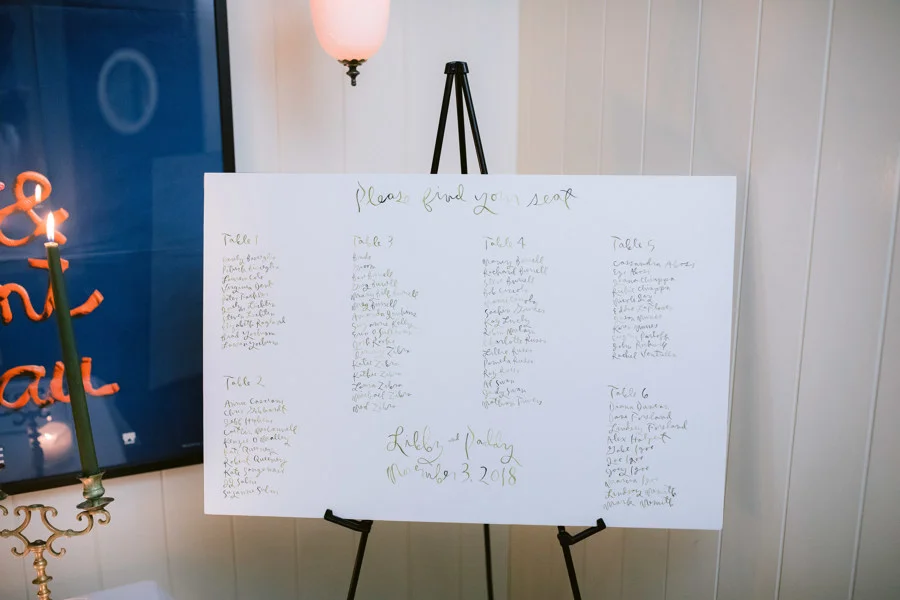
The day of pieces included: a seating chart, table numbers, place cards, koozies & matchbooks. The custom crest was recycled in a few of these pieces & is a a sweet nod to the wedding paper guests received prior to the big weekend.

WSPCo-11032018-Libby-Paddy-Wedding-468.jpg
IMG_3814.jpg
IMG_3815.jpg

VENUES: The Marlton Hotel & Lafayette

PHOTOGRAPHY: Eryc of Wilde Scout


We get lots of questions on developing the style for a wedding suite & this one is a great example of considering your event as a whole. This suite is a perfect compliment to the subtle and classic feel of this wedding. Plus it’s always extra special when we get a peek into the big day & where all the wedding paper ends up!

3 Ways to Work in Your Wedding Website

working in your Wedding Website

More and more couples are utilizing a wedding website. They’re a great solution for keeping all the detailed information together and are easily accessible for all your guests. There are three ways we incorporate them most often, but the sky is the limit!

05A67E77-F1FF-49FF-A385-7793C951A7D1.JPG

Details Card

An additional card for all your wedding details is always our first suggestion! We see a lot of weddings with events over multiple days in multiple locations and this card is really handy for guests to be able to hold onto to reference for the big weekend. It’s a great catch all for other logistical info as well: think hotel blocks, dress code, transportation, welcome events, etc!

D513B39A-6D6A-4AB7-95B8-3F164D580C9A.JPG
84C97315-C2DA-4726-80C7-61F3EF155F14.JPG

A Tag / Stand Alone Card

A tag or stand alone piece is a great way to inject a ton of personality into your suite & make it feel even more unique! We’ve been incorporating more and more custom tags tied on with thread to match the rest of your wedding paper. Tags are fresh, fun, and are sure to make your guests do a double take. We can also create a smaller card that fits in cohesively with website specific instructions & information. When the sole purpose of this piece is incorporating your website the size can be non-traditional and add a bit of visual interest. We love playing with contrasting colors on this smaller tag/card to make sure your guests notice it! 

B04EA53E-3E2E-43D5-9F6C-2EB1B5CEC13B.JPG

Main Invitation

If your budget doesn’t allow room for an additional card or stand alone piece, we can always add your url to your save the date or main invite (or both!). It can be a subtle addition at the bottom of either card. This solution is great for weddings that don’t have additional events outside the ceremony & reception and can keep the suite on the more simple and traditional side! 

Claire Suite Feature

Claire3-Alee.jpg

Claire Wedding Suite

bold • modern • romantic.

Claire.png

This wedding invitation suite is packed with floral charm! Letterpress printed with black ink on a warm white stock, this wedding suite is bold and sophisticated while maintaining its modern and graphic feel. It features a save-the-date printed on warm white stock with a custom floral illustration paired with a contrasting black envelope, and an invitation suite featuring: an invitation with floral illustration, reply card, and matching thank you card.

This is a fully customizable letterpress wedding invitation suite that can be modified top to bottom. Ink can be a blind deboss (printed with no ink!) or any Pantone color. Typefaces can be changed to preference. Essentially any element can be modified and tailored to accommodate your unique style and wedding. 

Every piece is hand printed and crafted by Alee & Press.

Claire1-Alee.jpg
Claire2-Alee.jpg

Honey Bee Baby Shower

We hosted a spring time bee themed shower for one of our dearest friends, Melissa, a few weeks back to celebrate her “Baby Bee”. Alyssa of Ginger Rose turned our studio into a daffodil dream & Rebecca and Joy of Sugar Spun Fun made a honeycomb cake that we still haven’t stopped talking about. 

06E4C0AE-C635-4347-9328-D40E9E6546D6.jpg
C813A7B0-7668-4664-8F89-81FAEA2A39A1.jpg
E44C2A95-C1F7-464B-A1A9-824947C39BF3.jpg
6F5F37CF-5157-474B-854F-39617649D7C4.jpg
DBE7D45E-1070-464D-B593-BCAF4CB73694.jpg

We wanted to create an extra special shower invitation for Mel. She had an inspiration board for us & we ran with a pale pink and goldenrod yellow palette. It felt feminine and energetic and perfect for a shower honoring her baby girl. The invitation is a two color letterpress piece and the bookplate, bee tag, and envelope liner are one color. We decided to mix it up with typography paring a more traditional serif with whimsical hand lettering for a relaxed vibe. The bee is a custom illustration that we then cut into a tag & tied on with thread.

43DAB9D1-4691-4AC5-8547-3941EC11B926.jpg
E3BE3A76-B0FA-4922-81BF-00247F76F360.jpg
5F32B234-642D-4BFA-AAFD-38D32700EB18(1).jpg

Alyssa of Ginger Rose:

When Amanda from The Impressionist approached me about doing the flowers for Melissa's Baby Shower, I knew that I wanted to do something fun and seasonal, which is where my inspiration to use many different varieties of Daffodils came to mind! 

Daffodils are one of the first official flowers to bloom during the Springtime, so I wanted to use them to mark the time of year that the baby shower took place, as well as to tie in the "Honey Bee" theme because they are such a great shade of yellow!  

From there, I decided to do a textural, floral-heavy garland that would serve as a focal point for Melissa's special day!  To do this, I incorporated different shades of Waxflower and Mimosa blooms to highlight the different varieties of Daffodils.  The end product resulted in a fun and funky garland that was both fragrant and seasonal for Melissa's Honey Bee Baby Shower!   


We had a blast dreaming up this extra special shower for Melissa & Baby Bee. We hope this inspired you for your next baby shower!